

What's Predicted Funds' Performance? The Thing That Wasn't Supposed to Work
Yep, past performance.

I was interested in the extent to which funds’ pre-fee returns predicted how they performed over subsequent periods. For instance, if a fund did well before fees compared to category peers over a trailing period, did that portend well for it to outperform those rivals over a subsequent period?
To address that question, I compiled stock, bond, and allocation funds’ rolling 60-month pre-fee returns over the past two decades.* The first rolling period was from Jan. 1, 2005 through Dec. 31, 2009, the second from Feb. 1, 2005 through Jan. 31, 2010, and so forth all the way through the five years ended Dec. 31, 2024. (This will get less boring in two paragraphs in case you’re wondering.)
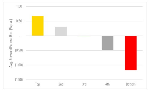
I grouped the funds by the percentile ranking of their pre-fee returns versus other funds in their peer group for each five-year period. My groupings followed a normal distribution, i.e., best 10% = “top”; next 22.5% = “2nd”; middle 35% = “3rd”; next 22.5% = “4th”; worst 10% = “bottom”. Then I calculated the average forward pre-fee return of each fund in those cohorts and compared to all other funds of that type.**
And this is what it looked like: An almost perfect sort, with the best past performers going on to notch the best future performance, on average, and the opposite for the worst past performers.
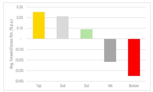
That’s what you call a good-lookin’ sort. Which, uh, isn’t what we’ve been trained to expect. This is past performance after all. And so, if you’re like me, you had questions. Questions such as…
Is it just a fluke?
This isn’t a statistically rigorous analysis, I will admit, but here’s a look at the year-by-year average excess returns of the different cohorts. (2018, for instance, averages the average excess returns of all funds for the rolling periods ended in any of the twelve months ended in 2018, and so on for the other years shown.)
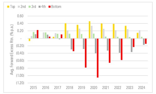
What the chart seems to show is that this isn’t some flash in the pan phenomenon. Rather, we’ve seen the same pattern for quite some time.
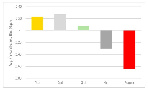
Is it just an asset class thing?
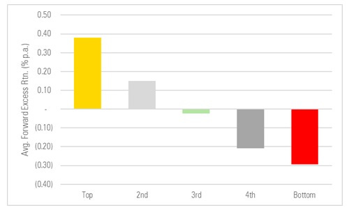
For instance, maybe past performance has been unusually persistent in, say, stocks but not so much in bonds and multi-asset funds and because there are more stock funds that’s distorting the picture? So I re-ran the same analysis, this time grouping by asset class to control for those differences, and…
Equity Funds
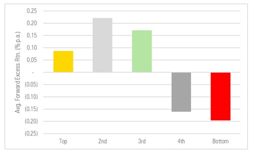
Fixed Income Funds
Allocation Funds
It doesn’t appear to be an asset-class thing. The sorting pattern was similar across stock, bond, and allocation funds.
Is it just a risk thing?
Ok, sure, it doesn’t appear to be ephemeral or confined to one type of fund. But maybe it’s just a risk/reward thing? That is, the best past performers have been taking on more risk, risk has been rewarded, and so really all you’re seeing is different payoffs to risk and those payoffs can change dramatically as time goes on.
Fair enough, to control for risk I compiled these funds’ pre-fee risk-adjusted returns (i.e., their rolling five-year Sharpe Ratios) and repeated the exercise. If it’s a risk thing, then that should express itself, resulting in a poorer sort when you use a risk-adjusted measure like a Sharpe.
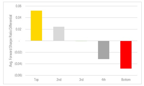
Aaannd…it doesn’t appear to be a risk thing either. The funds that had the best pre-fee past Sharpes tended to have the best pre-fee forward Sharpes (when compared to their average peer) and vice versa for the laggards.
Is it just a before-fees thing?
Lastly, we have to ask whether the picture looked different once we baked fees in. Here it’s a bit apples-and-oranges — we’re grouping funds based on their pre-fee past returns vs. category peers and then measuring their subsequent performance based on net returns.
In summary, even if you ignored fees and chose funds based on their past pre-fee performance, you still tended to do better *after* fee over subsequent periods. The sorting isn’t quite as emphatic on this basis — this can owe to, say, some very high performers before fees charging a lot and coming up short after fee when we measure subsequent excess net returns. But on the whole it’s not too different a picture.
Conclusion
We can get into the hows and whys in a different post, but pre-fee past performance did a very good job of predicting funds’ subsequent performance, on average, over the past few decades, almost no matter which way you looked at it.
Footnotes
* There were more than 10,300 U.S. open-end funds and ETFs in the study universe, including dead funds. To be included, each fund had to be classified as an equity, fixed income, or allocation fund, have at least one rolling five-year pre-fee return, and have a category classification at the beginning and end of each rolling five-year period that had a return. I only included the oldest share class of each fund, as the tests were before fee and the pre-fee returns of multi-share class funds would be identical and so this avoided needlessly over-representing multiple share class funds in the results.
** For instance, once I identified the “top” large-growth funds based on their pre-fee returns vs. other large-growth funds over the five years ended Mar. 31, 2017, I tracked their performance vs. all other large-growth funds over the five years ended Mar. 31, 2022. (To be more precise: I averaged those “top” funds’ subsequent pre-fee returns and subtracted the average return of all large-growth funds over that period to derive an average excess return for that cohort.). I did this for all cohorts, peer groups, and rolling periods. Then I averaged those averages over the full twenty-year span.
The views and opinions expressed in this blog post are those of Jeffrey Ptak and do not necessarily reflect those of Morningstar Research Services or its affiliates.