It's So Simple
Fees predict performance.

Over the weekend I was working on a project and did some analysis of how well fees have predicted funds’ future relative performance. I hadn’t planned on publishing it (as I’ve already written quite a bit on this topic) but thought, hey, why let it go to waste. So here’s a quick post summarizing what I found.
Before I get to the results, let me briefly explain what I did: I sorted all U.S. open-end funds and ETFs (excluding fund-of-funds but including dead funds) into five cost buckets based on the expense ratios they levied in the years 2009 through 2024. Essentially, I compared their fees to that of other funds in the same peer group at the time and bucketed them as follows:
The cheapest 10% of funds went into the “Cheapest” group;
the next 22.5% based on price went in the “2nd” bucket;
the middle 35% in the “3rd” group;
the next priciest 22.5% in the “4th” group;
and the costliest 10% went in the “Priciest” bucket
After bucketing funds in this manner, I compared their return in a given month to the average return of all other funds in the same peer group that month, the difference being the monthly excess return versus the category average. I repeated that for all funds and months. Since I had a monthly peer group history and also a time series of expense ratios, this ensured I would assign funds to a cost bucket appropriately (based on its expense ratio the prior year) and do an apples to apples comparison (based on its category classification that month).
Once I had all of these monthly excess returns, I averaged them for each cost bucket every month and then compounded the monthly average excess returns to derive the trailing figures shown below. The full period ran from 8/1/2010 to 7/31/2025, so fifteen years in total.
Anyway, here’s how it came out.
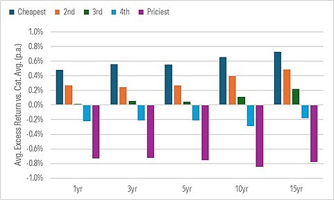
Talk about a good sort. It’s an almost perfect stairstep from the cheapest funds to the priciest and it didn’t matter how long the period was. In fact, the longer the trailing period stretched, the wider the outperformance margin grew between the average cheapest fund and the average priciest fund, with the other groups following suit.
This shouldn’t come as a surprise. My colleague Russ Kinnel found much the same thing in a landmark research study he conducted nearly a decade ago. But it’s always refreshing to see something so simple—pinching pennies and beating the higher-cost competition—work so well.
The views and opinions expressed in this blog post are those of Jeffrey Ptak and do not necessarily reflect those of Morningstar Research Services or its affiliates.
Definitely worth posting, good visualization.
the sellers of said funds, of course, might argue/suggest that while the average expensive fund underperforms, perhaps THEIR fund is special.
The buyer/prospective buyer of said fund, having seen your charts, is making the judgement that THEY have the ability to pick the needle in the haystack (or at the very least, hard-to-find-thing in the haystack).
Give me my passive funds and low cost funds....that's a game I can win.
Thank you for posting this super-interesting analysis. Any insights on the reason for the fact that inexpensive funds perform much better? I would not have been surprised to see high fees/low fees funds performung similarly. But the a clear inverse correlation between fees and performance is astonishing. Any insights in why?